Modern house interior finishes for warm, durable and low-maintenance homes
A modern finish palette is more than a look
Modern house interior finishes are no longer defined by white paint, glossy surfaces and gray flooring alone. The stronger direction is a coordinated material palette that feels warmer, performs well and supports everyday use. That means planning wall finishes, floors, cabinetry, counters, tile, metals and trim as one system, rather than selecting each product in isolation.
A modern home can still be clean-lined and simple. The difference is that better projects now combine texture, natural-looking materials, low-sheen surfaces, practical maintenance and indoor air considerations. For homeowners, designers and builders, the question is not only whether a finish looks modern on installation day. It is whether it will still make sense after years of cooking, cleaning, sunlight, pets, children, moisture and changing furniture.
What is changing in modern interior finishes
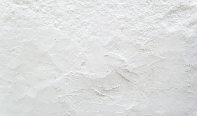
The most visible shift is away from cold minimalism and toward warmer, more tactile interiors. Public trend research from Houzz in 2026 pointed to rising interest in finishes such as Venetian plaster, limewash-style interior paint and terracotta flooring. These choices have a shared design value: they add movement, mineral character and surface variation without making a room feel cluttered.
Kitchen and bath research shows a similar direction. The 2026 U.S. Houzz Kitchen Trends Study reported that wood became the most popular cabinet color among renovating homeowners in the study, surpassing white. The same study showed continued interest in veined countertop patterns and practical kitchen upgrades. NKBA | KBIS, in its 2026 kitchen trends reporting released in September 2025, also emphasized personalization, wellness, layered lighting and functional spaces as major design drivers.
These reports do not mean every house should follow the same trend. They do show that modern design is becoming less sterile. Instead of relying on a single all-white envelope, many projects now use a restrained mix of wood, stone-look surfaces, plaster textures, muted color, matte metals and carefully placed contrast.
Start with walls and ceilings because they set the mood
Walls and ceilings are the largest visible surfaces in most rooms, so they affect how every other finish reads. Smooth painted drywall remains the most flexible choice for modern interiors, but color and sheen matter. Soft white, warm off-white, mushroom, greige, clay, sand, muted green and blue-gray can make a modern space feel calmer than stark white or cool gray.
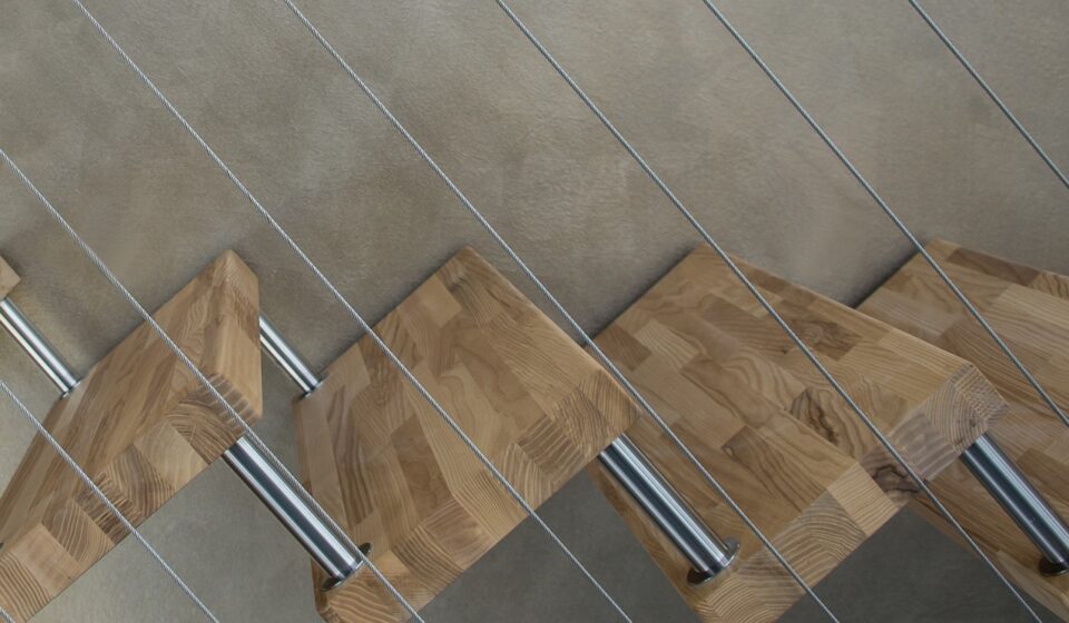
For a current look that does not feel overdesigned, use textured wall finishes selectively. Limewash-style paint, mineral paint, clay plaster, Roman clay and Venetian plaster can add depth behind a bed, in a powder room, around a fireplace or along a stair wall. These finishes often show natural variation, so installer skill and sample approval are important. A small swatch may not show how the surface will look across a full wall as the light changes during the day.
Ceilings deserve the same review. In many modern homes, a flat white ceiling is still appropriate because it reflects light and keeps attention on the architecture. Continuous color from wall to ceiling can work in smaller rooms, studies and powder rooms where a more enveloping effect is intentional. Wood ceiling accents, acoustic slats and painted beams can add warmth, but they should be used with restraint so the ceiling does not compete with flooring and cabinetry.
Choose flooring for continuity, safety and maintenance
Flooring is one of the hardest finishes to change later, so it should be selected for the whole-house plan, not just for one room. Modern interiors usually benefit from fewer flooring transitions. A continuous wood, engineered wood, porcelain tile or quality resilient floor can make a plan feel larger and more organized.
Natural wood and engineered wood remain strong choices where warmth is the priority. Medium wood tones are especially useful because they work with light walls, darker cabinetry and mixed metal hardware. Very pale floors can show dirt, while dark floors can show dust and scratches. Mid-tone finishes often provide the most forgiving balance.
Porcelain tile is useful in entries, bathrooms, laundry rooms and other high-moisture areas. Large-format tile can reduce grout lines and create a cleaner modern look, while stone-look and concrete-look tiles offer texture without the maintenance demands of some natural materials. For bathrooms, laundry rooms and entries, slip resistance should be checked carefully. A floor that looks beautiful in a showroom may perform differently when wet.
Luxury vinyl plank and other resilient flooring can be practical in rental units, basements, busy family homes and budget-sensitive projects. The design risk is choosing a printed wood or stone pattern that repeats too obviously. When using resilient flooring, inspect full-size samples, review the pattern variation and follow manufacturer guidance on subfloor preparation, sunlight exposure and cleaning products.
Use cabinetry, trim and millwork to add architectural order
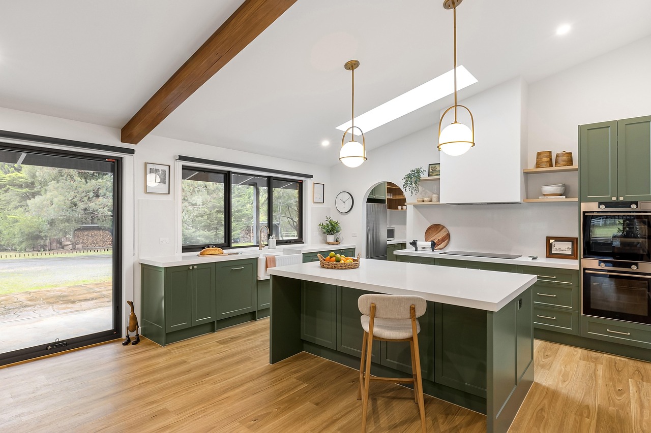
Cabinetry and millwork are where modern interiors can become either refined or flat. Slab doors, slim Shaker profiles, integrated pulls and simple rails can all work in modern homes, but the finish should connect to the rest of the palette. A kitchen with wood cabinets, stone-look counters and quiet walls may feel warmer and more durable than one that depends on a single high-contrast feature.
Wood-look finishes should be selected with grain scale in mind. Straight grain, rift-cut oak, walnut tones and clean maple often read more modern than heavy cathedral grain. If using stained wood, compare samples vertically and horizontally because grain can appear different on cabinet doors, drawer fronts and panels.
Painted cabinetry is still relevant, especially in off-white, taupe, muted green, navy, charcoal and soft black. Sheen is an important decision. Lower-sheen finishes feel more current and can reduce glare, but they may show oils and polishing marks in busy kitchens. A durable factory finish is usually preferable for high-use cabinetry, though site finishing can be appropriate for custom millwork when the process is controlled carefully.
Trim should not be treated as an afterthought. Modern trim can be minimal, but minimal does not mean unfinished or cheap. Flush base details, square casing, simple flat stock, shadow gaps and clean stair details require planning. If the budget does not support more complex modern trim, a well-proportioned simple baseboard and consistent door casing can still create a clean result.
Balance counters, tile and wet-area finishes
Countertops and tile carry a large share of the visual and maintenance load in kitchens and bathrooms. Quartz, natural stone, porcelain slabs, solid surface, stainless steel and butcher block can all work in modern interiors, but each has limits. The right choice depends on stain resistance, heat tolerance, edge detail, seam placement, cleaning habits and budget.
Veined surfaces remain popular because they add movement to simple cabinetry. The safer approach is to choose one dominant patterned surface and keep nearby materials quieter. For example, a veined counter can pair with a restrained backsplash, or a patterned tile can pair with a simple countertop. When counters, backsplash, flooring and cabinetry all compete, the room can feel busy even if each material is attractive on its own. See also: BUILDING MATERIALS.
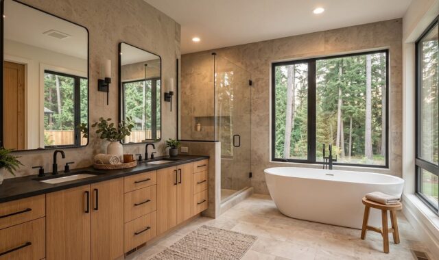
In bathrooms, modern finishes should prioritize water management. Large-format porcelain tile, solid surface shower panels, porcelain slabs and properly detailed niches can reduce grout maintenance. Natural stone can be beautiful, but it may require sealing and more careful cleaning. Before selecting stone for a shower, confirm whether the specific material is suitable for constant moisture and for the cleaning products that will be used.
Grout color affects both design and maintenance. High-contrast grout highlights tile pattern and installation quality, while closer-matching grout creates a calmer surface. In wet areas, grout type, waterproofing and installation quality often matter more than the tile itself. A premium tile installed over poor preparation is not a durable finish system.
Consider indoor air and compliance when selecting finishes
Modern interiors are often more tightly built than older homes, so finish selection should consider indoor air as well as appearance. The U.S. Environmental Protection Agency has noted that, from an indoor air perspective, it does not regulate household products under the Clean Air Act, and that low-VOC or no-VOC labeling can be more complicated than many consumers assume. In practical terms, buyers should read product documentation instead of relying only on front-label claims.
Paints, adhesives, sealants, flooring, cabinetry, composite wood panels and some wall coverings can all affect indoor air quality during and after installation. When possible, request technical data sheets, safety data sheets and third-party certifications that apply to the specific product, not just the brand. For composite wood products in the United States, EPA TSCA Title VI requirements are especially relevant. EPA consumer guidance states that regulated composite wood products and finished goods manufactured in or imported into the United States after March 22, 2019, must be certified as TSCA Title VI compliant; certain laminated products also became subject to testing and certification requirements beginning March 22, 2024, unless exempt.
Ventilation during installation is also part of the finish plan. Even lower-emitting products may have odors during curing. Schedule painting, floor finishing, adhesive work and cabinet installation with enough time for ventilation before occupancy, especially in bedrooms, nurseries and compact apartments.
A practical finish matrix for modern homes
| Finish area | Modern direction | Key risk to check | Durable choice |
|---|---|---|---|
| Walls | Warm neutrals, mineral texture, selective color | Overusing texture or choosing hard-to-repair finishes | Washable low-sheen paint with one feature texture |
| Floors | Continuous surfaces, medium wood tones, large tile | Too many transitions or slippery wet-area surfaces | Engineered wood in dry areas and porcelain in wet zones |
| Cabinetry | Wood tones, muted paint, slab or slim profiles | Trendy color on expensive permanent cabinets | Neutral main cabinets with expressive hardware or backsplash |
| Counters | Veined stone-look, quartz, porcelain or quiet solid surfaces | Pattern overload and poorly placed seams | One statement surface balanced by quieter finishes |
| Trim and doors | Simple profiles, consistent reveals, matte hardware | Minimal details that look unfinished | Clean flat stock, aligned casing and coordinated hardware |
| Bathrooms | Large tile, slab panels, warm metals, layered lighting | Waterproofing gaps and high-maintenance stone | Porcelain surfaces with tested installation assemblies |
This matrix is not a fixed recipe. It is a way to check whether each selection supports the same design goal. If a finish is beautiful but difficult to clean, easily damaged or disconnected from the rest of the house, it may be better as an accent than as a main surface.
How to build a cohesive finish palette
Begin with three anchors: one floor direction, one wood or cabinet tone and one wall color family. Then add counters, tile, metals and textiles around those anchors. This helps avoid the common problem of selecting every finish from a different showroom display.
A useful modern palette might combine medium oak flooring, warm white walls, taupe-painted secondary cabinetry, a softly veined quartz counter, off-white tile and brushed nickel or aged brass hardware. A darker version might use walnut cabinetry, pale stone-look counters, plaster-textured walls, blackened metal accents and large-format gray-beige porcelain tile. The palette can be quiet or expressive, but it should have a clear hierarchy.
Lighting must be reviewed before final approval. NKBA | KBIS 2026 kitchen trend reporting showed strong emphasis on natural light, quality lighting and task lighting. That matters because finishes change under different color temperatures and light levels. A cabinet color that looks balanced in daylight may turn yellow under warm LEDs or flat under cool lighting. Always review samples together in the actual room when possible.
For more material planning topics, visit the Interior Finishes section.
Frequently asked questions
What interior finishes make a house look modern without feeling cold?
Use simple forms with warmer materials. Medium wood tones, warm white walls, matte metals, stone-look counters, textured plaster accents and layered lighting can create a modern interior that still feels comfortable. The goal is clean composition, not a lack of personality.
Are matte finishes better than glossy finishes in modern homes?
Matte and low-sheen finishes often feel more current because they reduce glare and highlight material texture. However, glossy or satin surfaces may be easier to clean in some kitchens, baths and utility areas. The best choice depends on the room, touch level and product durability.
Should all interior finishes match throughout the house?
They should coordinate, not match exactly. Repeating flooring, trim color, hardware tone or wall color family can create continuity. Individual rooms can still have different tile, cabinetry or accent colors if they relate to the main palette.
Which finishes are easiest to update later?
Paint, cabinet hardware, decorative lighting, removable wall coverings, rugs and some backsplash areas are easier to update than floors, showers, countertops and built-in cabinetry. Put trend-forward choices in the easier-to-change layers and keep expensive permanent finishes more adaptable.
What should be sampled before ordering finishes?
Sample flooring, cabinet fronts, wall color, countertop material, tile, grout, metal hardware and lighting together. Review them in daylight and at night. For natural stone, wood and textured wall finishes, larger samples or mockups are especially important because variation is part of the material.